
Trends
Understand how users are using your app/ website with Trends.
Overview
Trends helps you track how your events and their attributes change over time. It gives you a combined table-and-graph view so you can compare segments, analyse patterns, and understand how user actions evolve over time. With selectable attributes and an interactive chart, Trends makes it easy to spot shifts, identify spikes, and monitor performance with accuracy.
With trends, the user can do the following:
- Track how events perform over a selected time period.
- Drill down into attributes such as location or device to compare segments.
- Toggle attributes on or off to customize the graph view.
- Analyze daily counts and averages in a detailed table format.
- Identify spikes, drops, and behavioural patterns with an interactive graph.
Create Trend
Create Trend
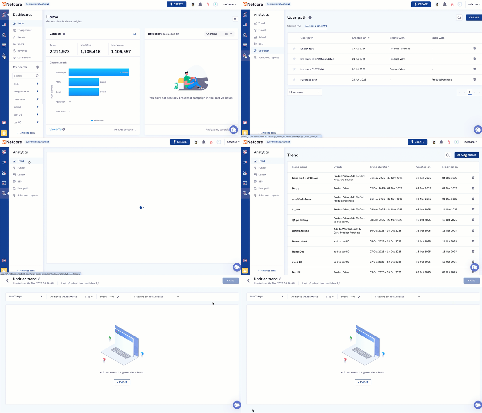
Follow the steps given below to create Trends:
- Log in to the Netcore CE dashboard and navigate to Analytics.
- Click Trend > CREATE TREND.
| Elements | Description |
|---|---|
| Duration | Select the number of days for which the Trend is to be analysed.
|
| Audience | Select from the dropdown any of the following options.
|
| Event | Select event(s) that a user must perform to qualify for analysis. ### Select your desired events from the dropdown. You can add up to 6 events. Select the Source type from the dropdown. The options include:
Click Specify payload parameter to add specific parameters for your events. You can add up to 5 payload parameters. Split by: Split the event data using a specific attribute (such as city or category) to compare performance across each value. Example: Once done, click Apply. |
You can further break down the combined dataset using Drilldown.
Drilldown
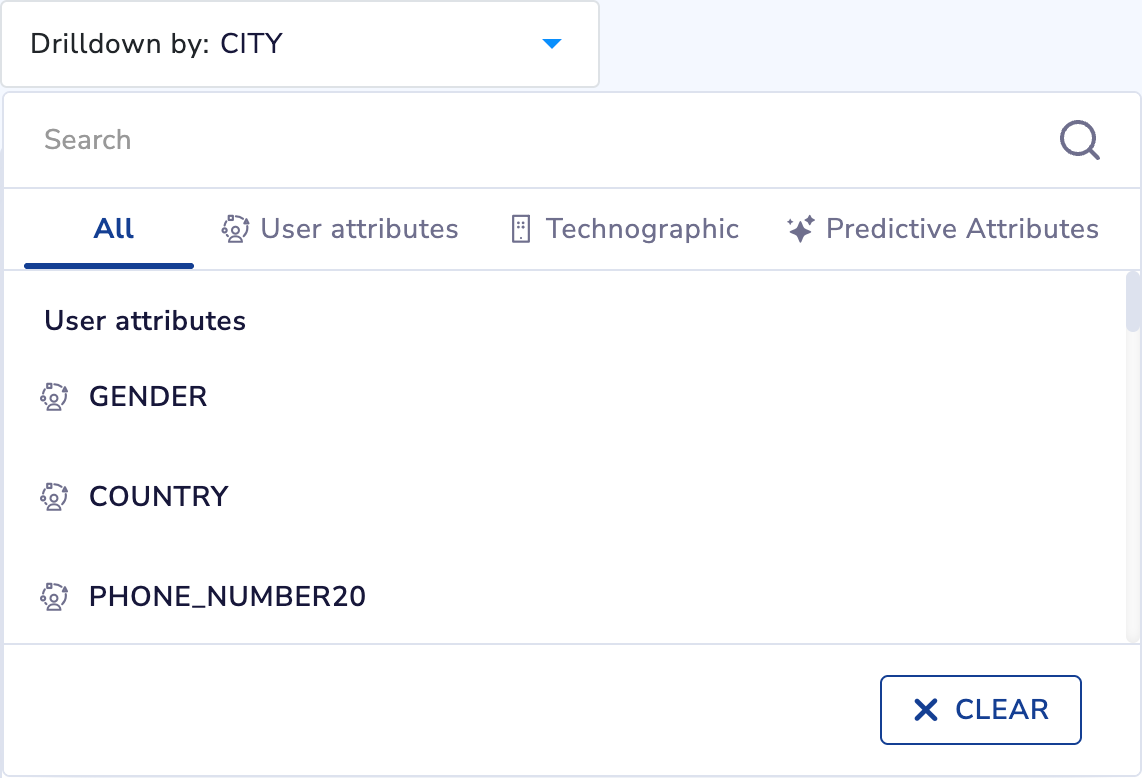
The drilldown feature lets you delve into user Trends by examining specific attributes or event payload parameters. This functionality enables you to create precise and impactful marketing campaigns.
Drilldown by Specific Attributes
- Access the Drilldown option located above the chart/graph.
- Select from the dropdown menu. The functionalities available here are:
- User Attributes
- Technographic
- Predictive Attributes
Refer to the table below to know about the functionality present under drill-down.
| Functionality | Definition | Use Case | Example Scenario | Insights |
|---|---|---|---|---|
| User Attributes | Breaks down event trends using user-level properties such as gender, city, state, or country. | Helps identify which user segments are most engaged or underperforming. | You drill down Product View by STATE to view activity from Maharashtra, Karnataka, and Delhi. | Shows which states contribute the highest product views, helping refine geo-targeted campaigns. |
| Technographic | Breaks down trends based on device, OS version, app version, or browser details. | Helpful in identifying performance issues or optimizing experiences for specific platforms. | You drill down Add to Cart by App Version to view if older app versions show lower conversions. | Helps identify version-specific drop-offs and prioritize app updates or fixes. |
| Predictive Attributes | Breaks down trends using AI-driven attributes such as category affinity or brand affinity. | Supports personalization by highlighting users most likely to engage with specific categories. | You drill down Product View by Category Affinity to view users with high interest in Electronics, Fashion, etc. | Reveals which affinity groups drive the most engagement, enabling targeted recommendations. |
Understanding the Metrics
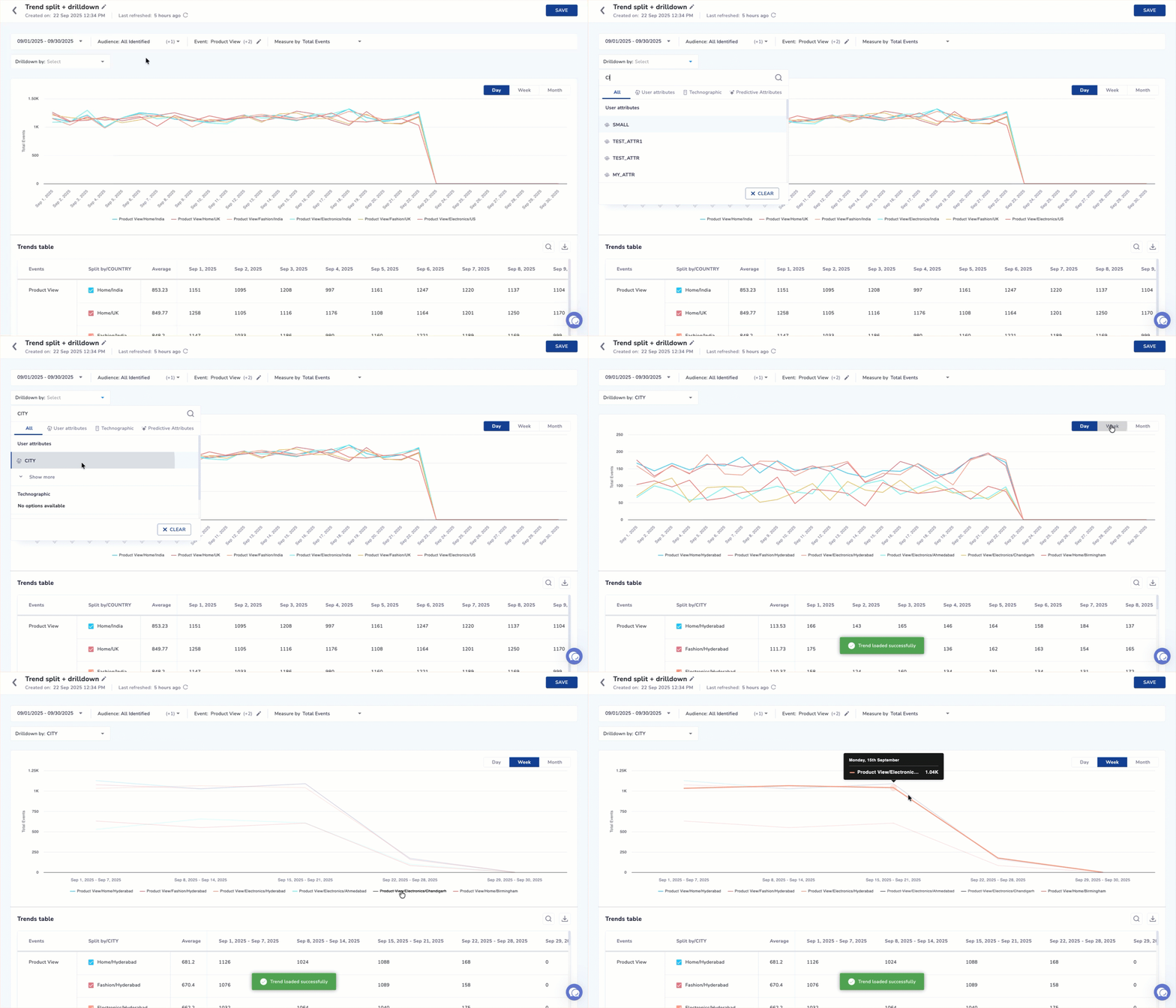
You can view the metrics in a graph displayed daily, weekly, or monthly. Hover over the graph to see accurate values for each metric.
The graph displays user activity over time:
- X-axis: Time buckets (Day, Week, Month) based on the selected event.
- Y-axis: The chosen Measure By metric (Total Events, Unique Users, and so on)
How to use the graph?
- Hover on any point to see exact values.
- Use the legend to hide/show specific lines.
- Change the Measure By metric to view different perspectives on the same events.
Explore Events Performance using Graph
Each attribute listed in the table can be visualized on the graph by selecting its checkbox. Once selected, the graph updates instantly to display the data for that attribute.
You can also control visibility directly from the graph legend. Clicking a legend header applies a strikethrough and hides that event from the graph, allowing you to focus only on the metrics you want to analyze.
For example, when viewing the First App Launch event and drilling down by States, selecting Rajasthan will update the graph to show its trend line. Deselecting it will remove the data from view.
This flexible interaction makes it easy to compare attributes and analyze event behaviour with accuracy.
Trends Table
Explore Event Performance using Trends Table
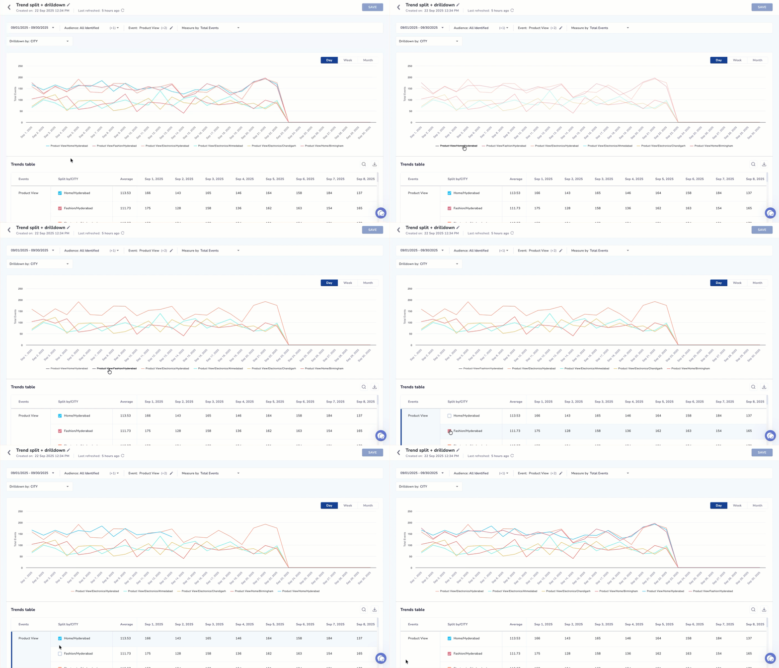
The Trends table gives you a detailed breakdown of how an event performs over time. Each row represents either the overall event or a specific attribute (such as a state, city, or category) based on the drill-down you selected.
NoteEach row in the table represents either:
- An entire event (if no Split By/Drilldown is applied), or
- A specific attribute value (for example, City = Mumbai), or
- A combination of Split By + Drilldown (for example, Category = Shirts / City = Mumbai).
Refer to the given table to know the features you must know when using the Trend table.
| Feature | Description |
|---|---|
| Sorting | The table automatically sorts rows by the Average column in descending order. |
| Search | Helps you find specific attribute values such as a city, category, or device. |
| Scroll | Vertical scroll is available when the list contains many rows. |
| CSV Download | Exports the complete table data for offline analysis or reporting. |
Refer to the given table to know the columns available in the Trend table.
| Column | Description |
|---|---|
| Event | Name of the event included in the Trend analysis. |
| Attribute | Displays the Split By value, Drilldown value, or a combination of both (e.g., Category / City). Each attribute includes a checkbox that lets you control what appears on the graph. - When the checkbox is selected, the attribute’s trend line appears on the graph. |
| Average | The average value of the selected metric (e.g., Avg Total Events) across the chosen time range. |
| Date / Time Columns | One column per time bucket (Day, Week, or Month) showing the metric value for each interval. |
| Selection Checkbox | Controls whether the row appears on the graph. Selected rows are plotted as individual trend lines. |
This makes it easy to compare multiple attributes, spot anomalies, and analyze how different segments behave across the selected timeframe.
Trends Listing Page
The Trends Listing Page provides a consolidated view of all the saved Trends. It helps you locate, review, and manage existing Trend reports. From this page, you can search for a Trend by name, view its configuration (events, duration), check when it was created or last modified, and delete reports that are no longer needed. Use Create Trend to set up a new Trend analysis.
Refer to the given table to view the available column headers.
| Header | Description |
|---|---|
| Trend name | The name given to the saved Trend view. Click to open and see the full Trend configuration and results. |
| Events | The list of events included in the Trend analysis. Shows the primary behavioural events used to generate the graph and table. |
| Trend duration | The date range selected when the Trend was created. |
| Created on | The date when the Trend view was originally saved. |
| Modified on | The most recent date on which the Trend view was updated or edited. |
| Delete | Allows you to remove the saved Trend permanently. |
Channel & Contact Events
You can now plot channel events (Email, SMS, WhatsApp, RCS, Push, Web Message, In-App) and contact events (Opt-in/Opt-out, User Added Activity) in Trends, alongside your existing app, web, and custom events.
Plot a Channel Event
Follow the steps given below to plot a channel event.
- Navigate to Analytics > Trends.
- Click Add Event and select a channel event from the picker. Events are grouped by channel (Email, WhatsApp, etc.).
- Apply the dynamic filters that appear based on the event type.
- Click Plot.
Measure By (Aggregation)
Channel events default to Total Events in the Measure By selector.
Advance Sort of Trends
| Sort | Behavior |
|---|---|
| High to Low (default) | Fetches data from the database in descending order (highest values first) |
| Low to High | Fetches data from the database in ascending order (lowest values first) |
Why this matters
By default, only top-performing values are fetched. Switching the sort lets you fetch the bottom-performing values directly from the database.
Example: For a D2C brand analyzing Product Purchase by City:
- Default (High → Low)
- Shows top 300 cities (best performers)
- Low → High:
- Fetches the bottom 300 cities (worst performers)
This helps identify underperforming cities (e.g., ranked 700+) and take targeted business actions.
Split By Multiple Properties
Trends lets you split a single trend line by two properties at the same time. Instead of viewing one property at a time, you can combine two, such as City and Device Type, to see segments like Mumbai | iOS in a single chart.
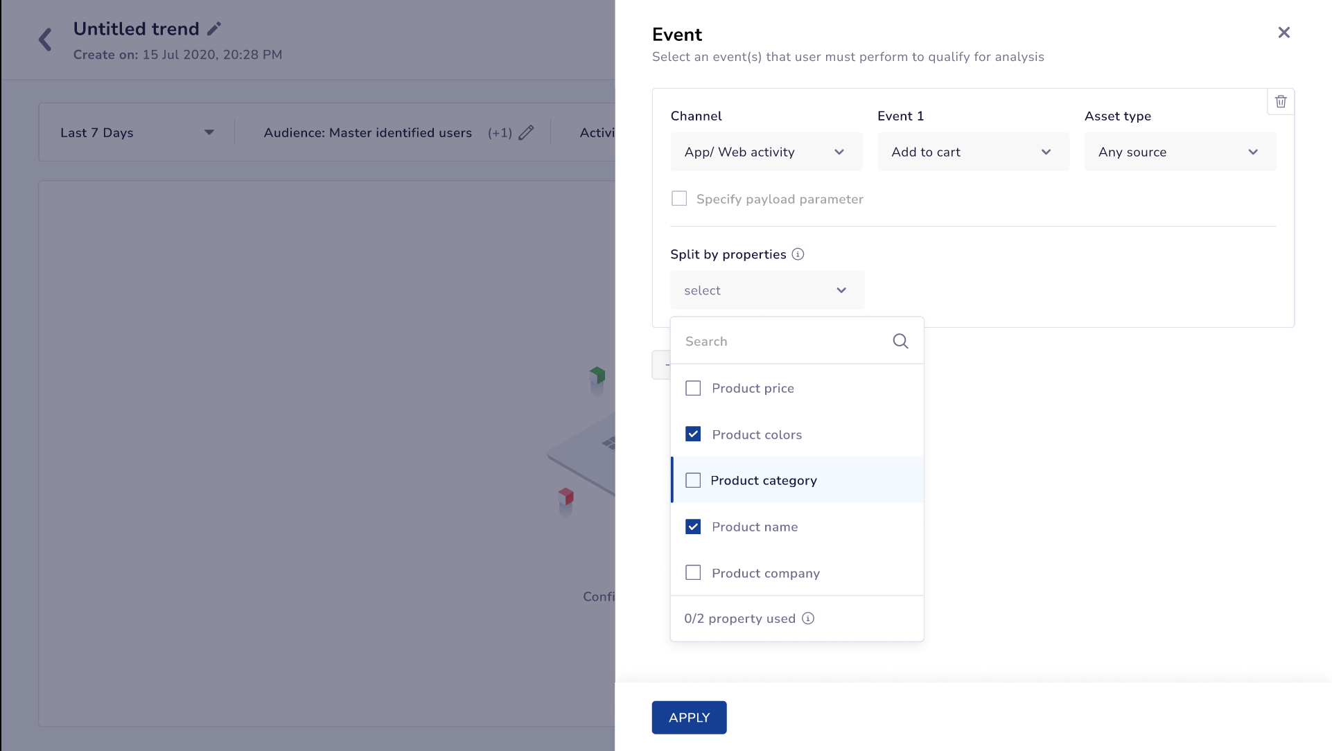
Add Split by Properties in Events
Example: You want to compare how your product categories convert across devices. You select Purchase as the event and apply Split by: Category and Device Type together. The chart now shows one line per category and device combination, such as Electronics | iOS and Electronics | Android, so you can see where each category converts best without building a separate segment for every combination.
Workflow
- Navigate to Analytics > Trends and select your event, as described in Create Trend.
- Under Split by, select your first property.
- Select a second property to split by. The chart now plots one line for each combination of the two property values.
- Click Apply to update the graph and table.
Each combined series shows both property values in the legend and the table, separated by a consistent delimiter.
Refer to the table below to understand how multi-property Split By behaves.
| Behavior | Description |
|---|---|
| Per-event independence | Split By applies to each event on the chart independently. If you plot more than one event together, each event can use its own pair of properties. |
| Events without the property | If an event does not carry one or both of the selected properties, it renders as a single, unsplit line. It is never dropped from the chart or shown as an error. |
| Existing saved trends | Trends and dashboards built on a single Split By property continue to work without any changes. |
Important Point to RememberMulti-property Split By supports up to two properties in a single Trend. Cross-event property harmonization (treating a property on one event as equivalent to a similarly named property on another) is not supported.
Cardinality Protection
Combining two properties with many distinct values can produce a large number of lines. When a combination crosses a set threshold, Trends warns you and either limits the view to the top combinations by volume or prompts you to narrow your selection, so the chart stays readable instead of failing or freezing.
Compare and Audience Controls
Trends now gives you more control over audience analysis and makes it easier to spot performance changes. Overlay a previous period on your chart, include or exclude specific lists and segments in the main filter, and compare up to three audiences side by side. These controls apply across the chart, the table, Split by, Drilldown, and every Measure By option.
NoteCompare to Past and Compare Audience cannot be applied together. Turning one on turns the other off.
- Click Compare, next to the Day/Week/Month toggle, and select a period: Previous day, week, month, quarter, half year, or Custom date. Trends overlays that past period as a second line on your chart.
- Hover on the chart to see the percent change against the previous period, for example +102% from past day. The wording tracks your active granularity (from past week, from past month, and so on), and also shows up when no comparison is applied.
Weekly views always render Monday to Sunday buckets, and monthly views always render full calendar months, for both series. If the past range has more buckets than the current range, Trends trims the extra; if it has fewer, Trends extends it backwards by one period so the counts match. A single date can therefore fall into a bucket in both series, this is expected.
Advanced Audience Selection
The main filter now supports Include and Exclude audiences, each built from up to five lists or segments.
Click Audience to include specific lists or segments, or Exclude Users to remove them. Search or browse by Master, All lists, Co-marketer segments, or Segments, select up to five, and click Done. Your selections combine into a single audience and plot as one line, not one per list.
Compare Audience
Compare up to two additional audiences alongside your base audience, for a maximum of three lines on the chart. Build your base audience in the main filter, then open Compare Audience and add up to two more. Each additional audience supports include only; use Exclude Users in the main filter for exclusions. Trends plots a line per audience and shows each one's value and percent change in the tooltip.
When Split by or Drilldown is active, each event's row budget is shared evenly across the compared audiences, with any rounding leftover going to the first audience (for example, 3 audiences sharing 100 rows get 34/33/33). The usual Others grouping still applies beyond that. Without Split by or Drilldown, each audience appears as its own row per event.
Formatting improvements
Trend series now render in visually distinct colours, even across many Split by or Drilldown combinations. Total Events per User now displays to 2 decimal places, for example 1.34, instead of rounding to a whole number.
Updated 4 days ago