
Product Block in AMP Email
Showcase items, catalogs, or real-time inventory directly inside an AMP email with the Product Block.
The Product Block now works inside AMP Drag & Drop emails. You can add product content such as recommendations, catalog picks, product feeds, collections, and merchandising-triggered products, the same way you already do in HTML Drag & Drop emails.
Prerequisites
Before you start, make sure:
- Product Catalog Integration is enabled for your account.
- At least one catalog is synced to your account.
Add Product Block
Refer to the steps below on how to add a product block in the AMP email editor.
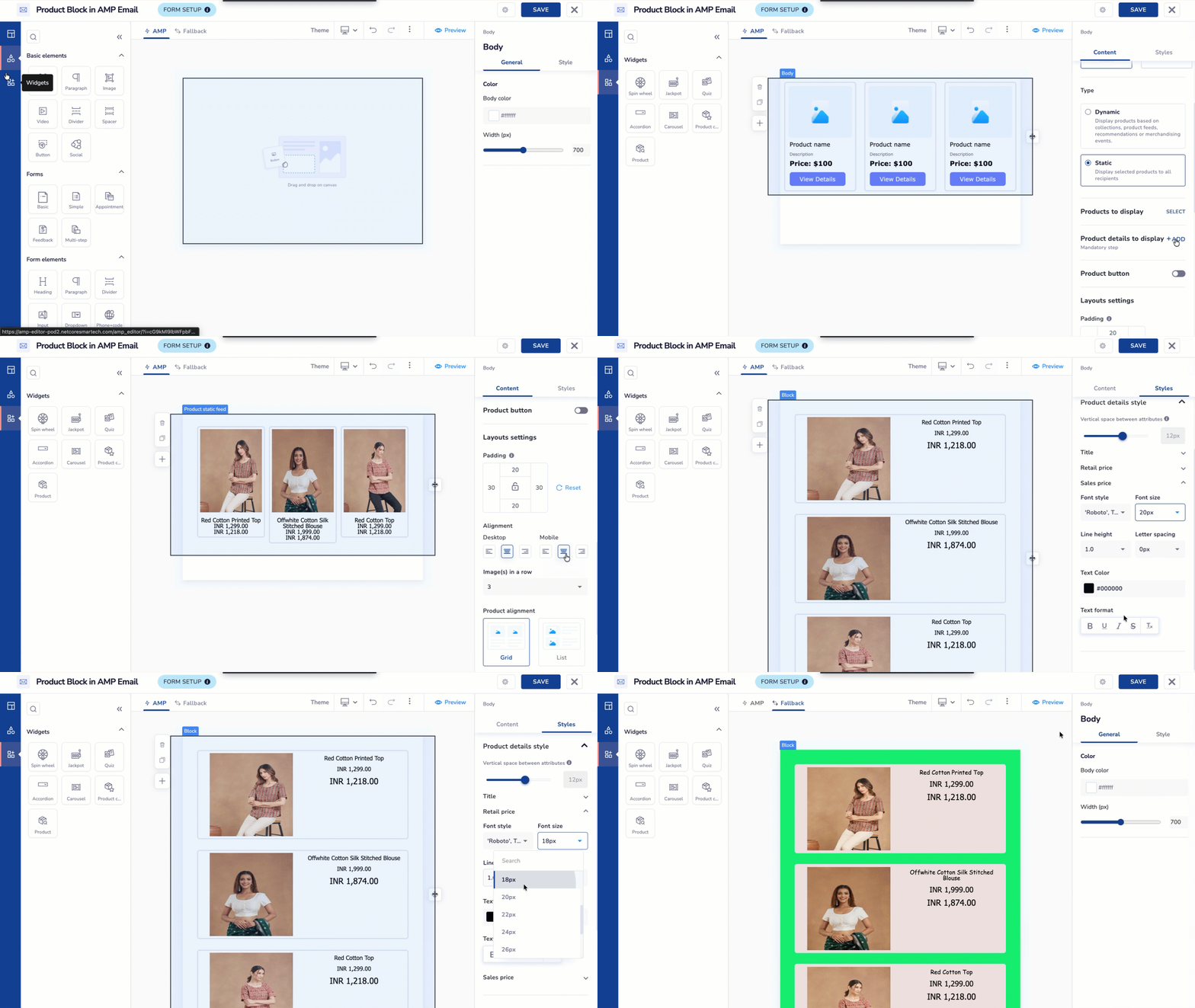
Add Product Block in AMP Email Editor
- Log in to the Netcore CE dashboard and click CREATE > Email > AMP.
- Spot the Widget section in the left pane and drag & drop a Product block on the canvas.
- Click on the block. Multiple options appear on the right pane.
General Options
Refer to the table below to learn more about General options.
| General Options | Description |
|---|---|
| Type | Select the method for displaying products in your email: Dynamic: This displays products that update automatically based on predefined rules or triggers. These rules can be based on:
Static: This displays a fixed selection of products selected manually by you. These products remain the same for all recipients, regardless of their preferences or behavior. When you choose Static:
|
| Products to display | Click SELECT to choose the specific products you want to add to the email. |
| Product details to display | This is a mandatory step to select the product details to include. You can choose up to seven details such as name, price, or description. Click Edit to select labels, map attributes, and redirection URLs, then click Save. |
| Button | Toggle On/Off to include a button for each product and add custom button text. For example, Buy now or Add to cart. |
| Padding | Adjust the spacing within the template. |
| Alignment | Align the selected element within the template. |
| No. of images in a row | Specify the number of product images to display per row in the email from a dropdown menu. |
| No. of products | Select the number of products to include in the email from a dropdown menu. |
| Image Alignment | Set the alignment of product images: Left or Right. |
| Product Alignment | Select how products are displayed in the email: Grid (products arranged in rows and columns) or List (products arranged vertically). |
| Responsive | Select whether you want to hide the element on mobile devices or a computer. |
Style Options
Refer to the table below to learn more about Style options.
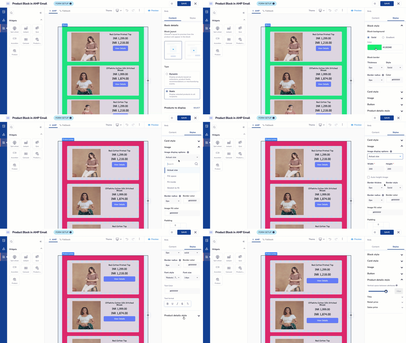
Product Block Styling Options
| Style Options | Descriptions |
|---|---|
| Block Background | Allows you to set background colour or image. |
| Block border | Allows you to adjust border thickness, style, colour, and corner radius with Border Settings.
Solid: Creates a continuous, solid line for the border.
|
| Card style | Define how individual product cards are displayed. Image display options are Actual size, Fill space, Fit inside, and Stretch to fit. You can also edit the width, height, border color, thickness, style, and corner radius. |
| Image properties | Image display options: Actual size, Fill space, Fit inside, Stretch to fit You can also edit width, height, border color, thickness, style, and corner radius. |
| Button | Toggle the button on or off. Set the button text, font style, color, and alignment. |
| Product details style | Use the slider to set the spacing between details. Select font style, size, and color for the product name. |
| Gradient | Allows you to create gradual changes of colour within the template using the Gradient Type and Gradient Direction. Gradient type: It refers to the specific manner in which colors transition within a gradient.
Gradient Direction: Select the direction for the gradient effect, including top, right, center, bottom, or left. |
Dynamic Rule in Product Feeds
- If no products are fetched due to an out-of-stock catalog, the email will be suspended. The journey will continue, but the email will not be sent.
- If a dynamic rule is in a template and the product feed is deleted, the email will also be dropped, while the journey remains active.
-
When your template is ready using your desired elements and settings, click the Live Preview button to see how it will appear on the website.
Preview Product Block -
Click the Preview button at the top of the editor.
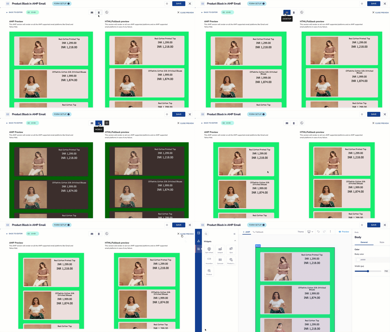
Preview the Product Block
The preview pane opens with two columns.
- AMP Preview on the left shows how the email renders on AMP-supported clients like Gmail and Yahoo Mail.
- HTML/Fallback preview on the right shows how it renders everywhere else, and on AMP clients if the AMP version fails.
- Use the toggles at the top center to check how the block looks under different conditions:
- Desktop and Mobile icons switch both preview columns to that screen size.
- The clock-style icon switches between light mode and dark mode, so you can check contrast and readability either way.
- Click Back to editor to make more changes, or Close preview to exit.
-
Click Save & Close once you finish configuring the block.
ImportantIf a template uses a product feed that gets deleted later, an error message will appear saying Feed used in this template has been deleted.
Campaign and Journey Availability
The product source you pick decides where the template can go.
Works in campaigns and journeys:
- Static Product Picker
- Product feed (custom feed)
- Recommendation algorithms marked as campaign-compatible
Works in journeys only:
- Collection
- Merchandising events
- Recommendation algorithms marked as journey-only
Important Points to Remember
- If a template has more than one Product Block, and even one block uses a journey-only source, the whole template becomes journey-only. It won't appear in campaign template selection, and the "Use in campaign" option disappears from the template flow. It still shows up normally in journey template selection.
- You can't use Collection and Merchandising events in the same template. If one is already added, the other stays blocked.
- Templates that use Collection show their template type as Product Collection in the journey flow, since this source needs an extra setup step there.
Good to know
- The block shows a preview in the editor. It doesn't preview live or random products yet. Dynamic preview support arrives with a separate release.
- Send test uses the current behavior for now. Enhancements for Collection, Merchandising events, and Recommendation-based templates arrive with a separate release.
- Product Block errors show the same error message style you already see in HTML emails. No new pop-up interrupts your flow.
- The existing Shopify Product Collection block doesn't change. It stays separate from the standard Product Block covered in this guide.
- Product and block limits follow your account's global settings, the same as HTML emails.
Updated about 4 hours ago